Wednesday, December 31, 2014

Pierre Huyghe: Unexpected Pleasures and Disappointments

To naysayers of contemporary art, Pierre Huyghe’s retrospective at LACMA is bound to be the last straw. To an open mind, it will have a positively jostling impact. Huyghe’s body of work is as contemporary as it gets: it is unpredictable, hyperkinetic, and not for the lazy. This exhibition requires an amount of effort, be it in the form of resistance or surrender. It is hard to be unaffected by what might as well be a self-governing organism: a smattering of live ants follow a trail of rat pheromone; Human, the artist’s dog, perambulates the galleries; there are a few giant aquariums, and then there is Untilled (Liegender Frauenakt), the reclining nude with an active beehive for a head. The artist is not the sole meaning-maker here.

Untilled (Liegender Frauenakt), concrete cast with beehive structure, wax. Photo courtesy Annenberg Media Center

Pierre Huyghe (pronounced hweeg) was born in 1962 in Paris and since the 1990s has been playing with the concept of “auto-generative” art. If you thought Alexander Calder’s kinetic sculptures — shown in the same pavilion earlier this year — were animated, Huyghe’s exhibition will stop you in your tracks.

The threshold into Huyghe’s world is disappointing, if not anticlimactic—you are welcomed by nothing but blank walls angled in seemingly slapdash ways. It is confounding, until the sense of disruption morphs into liberation: Ah, I see, this exhibition is here for me to play. If the artist can break boundaries so can I.

One protean space leads to another, or to a dimly lit room, or to a manufactured world outside, dripping with precipitation (fog, snow, rain). In some recesses there is so much light deprivation you get the urge for a dose of sun. Sounds echo around you, some so vivid you can’t tell if they’re real-time or from one of the handful of films rolling. 

Installation view.
Photo courtesy Esther Schipper

In Huyghe’s twenty-five year career, film has been a mainstay. His 2014 film, Untitled (Human Mask), captures the human penchant for manipulation: a monkey, wearing the mask of a woman, is being trained to work as a waitress. Huyghe describes it as a dystopic portrait of human alienation. It feels perfectly apropos for the disorienting, sometimes sparse, sometimes lonely spaces in this exhibition.

Untitled (Human Mask), 19-minute film. Photo courtesy LACMA

Even if Pierre Huyghe feels a bit like the artist’s personal play space, it is splendidly self-aware. The raw, unframed documents on the display feel like personal messages from Huyghe. L’Ecrivain public is his chronicle of the exhibition's opening, voyeuristic and full of banal observations that cannot resist amusement (celebrities and museum aristocracy, like Director Michael Govan, are mentioned). Reading it soothes the urge to be that fly on the wall.

Look up and you'll notice the ceiling doubles as a light grid that visitors can operate. Before reaching for a joystick, you have to ask yourself, Am I allowed to touch this?

This is where Huyghe’s exhibit can get infuriating. You don’t know where the lines end and begin. The synchrony couldn’t be more perfect: Huyghe is pushing you to challenge your obedience in manufactured spaces. You learn to anticipate moments of freedom, and, inversely, moments of disappointment: those beds of piled fur, begging to be sat on? Those are not for you but for Human, the artist’s Ibizan hound.

Human, dog.
Photo courtesy Autre

Pierre Huyghe is on view at LACMA through February 22, 2015.
Thursday, November 13, 2014

Shangri La: A little bit of paradise in LA

It's a breath of fresh air, walking into a gallery full of pre-loved objects: an ivory door with nicks, a tapestry that has clearly seen better days. These are just a fraction of Doris Duke's collection now on view at LA Municipal Art Gallery's exhibition, Shangri La: Architecture, Landscape and Islamic Art. The eponymous spotlight of the show is the heiress and philanthropist's estate in Honolulu, envisioned after a honeymoon to India and the Near East; Hawaii was the last stop on she and her (first) husband's return home. Smitten by the landscape, Duke bought land overlooking Diamond Head and immediately drew up the blueprints. 

The heiress filled her home with a vast and varied collection: art from India, Spain, and Central Asia; a collection of Islamic art so substantial that it gave rise to the Doris Duke Foundation for Islamic Art. The objects at LAMAG are on loan from the foundation, not including the work of twelve artist residents who spent some weeks at Shangri La in 2010.

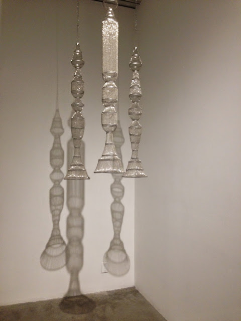
The residency clearly left an impression on its benefactors. Iranian artist Afruz Amighi described the estate as an "idyllic Eden." His installation, Rocket Gods, references the omnipresence of naval bases on the island— a strange contrast to the serenity of Honolulu. Here the rockets and missiles are in disguise as chandeliers, much akin to the spectacular ceiling lamps of the Islamic world.

Afruz Amighi, Rocket Gods, 2010
Aluminum and base-metal chain
Photo credit: Parisa Rezvani

It seems to be a trend these days, pairing contemporary art with historic. (Last year the Istanbul Archaeological Museum offered contemporary riffs on the Ravenna mosaics of Byzantium; Versailles now rotates contemporary art in its palace on an annual basis.) But the pairing of historic and contemporary is doubly apropos for this exhibition: Duke was a fan of both old and new. In fact she commissioned living Islamic artists to make work for her estate, including architectural features.

Enjoy some highlights below of the exquisite furniture, clothing and accessories from the LAMAG exhibition, which also appeared at New York's Museum of Art and Design in 2012.

Robe, nineteenth-early twentieth century, probably Turkey
Silk
Photo credit: Olivia Fales
Robe (detail)
Photo credit: Olivia Fales

Pair of ear ornaments, nineteenth century, India (Delhi)
Enameled gold, white sapphires, rubies, seed pearls, emerald beads, cord
Courtesy Doris Duke Foundation for Islamic Art

Chair, early nineteenth century, Iran
Wood inlaid with ivory, ebony, brass
Photo credit: Olivia Fales

Rosewater sprinkler, eighteenth to nineteenth century, Iran
Glass, mold blown and hand blown
Courtesy Doris Duke Foundation for Islamic Art
Chest of drawers, late seventeenth century, Spain
Wood, mother of pearl, ivory, ebony, metal hardware
Courtesy Doris Duke Foundation for Islamic Art


Doris Duke's Shangri La: Architecture, Landscape and Islamic Art runs through December 28, 2014.

Wednesday, October 8, 2014

Candy, etc. at William Turner Gallery

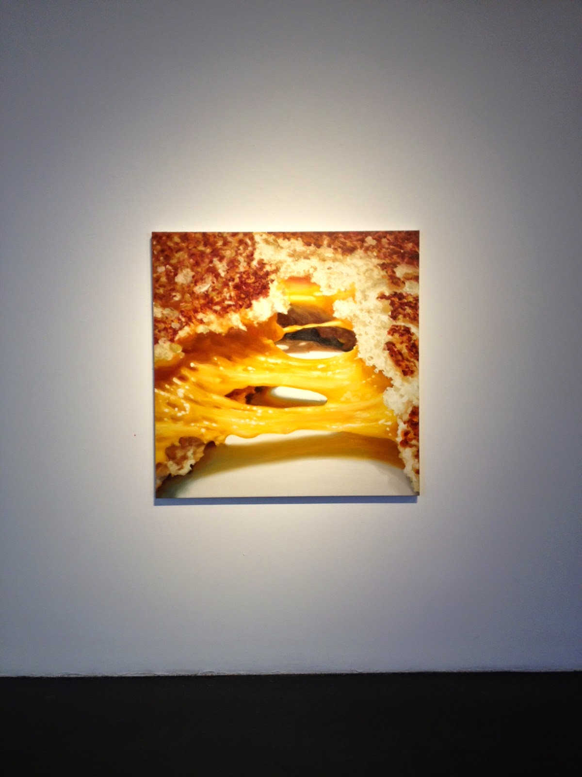
Right, more abstract paintings. That's what Carole Bayer Sager's new work makes you think; but not for long: when viewed up close they look fuzzy— even messy. But at a distance, they assume a level of clarity that verges on the photographic. A classic case of the Monet effect. You need a large space with ample leg room to show this kind of work.

Sager's subject matter is popular: in her solo show at William Turner Gallery, food is the focus. What distinguishes her work are the titles. Many aren't about the food itself but what happens to it after human intervention: TornShredded, Pulled. These stand-alone participles sound mildly aggressive. In many ways, that's what eating is.

On the other side of these actions is delight. Sampled, a delightful mess of boxed chocolates, is a case in point.

Sager makes us think about the food itself. Her Portrait of an M&M Peanut, while somewhat contrived, is an ode to mindful eating. It is the equivalent of a Ken Price sculpture: a view into the anatomy of an object. It's not often that we meditate on the viscera of delectables— and there's no need to, but it's nice to be reminded every now and then.

Carole Bayer Sager: New Works is on view at William Turner Gallery through November 8th.

Torn (detail), 2014, oil on linen, 48" x 48"
Photo: Olivia Fales

Torn, 2014, oil on linen, 48" x 48"
Photo: Olivia Fales

Shredded (detail), 2014, oil on canvas, 84" x 84
Photo: Olivia Fales

Shredded, 2014, oil on canvas, 84" x 84
Photo: Olivia Fales

Portrait of an M&M Peanut, 2014, oil on linen, 36" x 36"
Photo: Olivia Fales

Installation view, with Portrait of an M&M Peanut at center
Photo: Olivia Fales

Wednesday, September 17, 2014

Modern Kimonos at LACMA

Here's a preview of some favorites from the LACMA exhibition, Kimonos for a Modern Age, on view through October 19th.


Woman's Kimono with Abstract Pattern (Japan, c. 1950)
Silk plain weave, stencil-printed warp and weft
Photo: Olivia Fales

Woman's Kimono with Abstract Landscape (Japan, c. 1950)
Silk plain weave, stencil-printed warp and weft
Photo: Olivia Fales

Woman's Unlined Kimono with Abstract Design (Japan, c. 1955)
Silk plain weave, stencil-printed warp and weft
Photo: Olivia Fales

Woman's Kimono with Geometric Pattern (Japan, c. 1955)
Silk plain weave, clamp-resist-dyed warp and weft
Photo: Olivia Fales

Woman's Kimono with Overlapping Hexagons (Japan, c. 1940)
Silk plain weave, stencil-printed weft
Photo: Olivia Fales

Monday, August 11, 2014

Larry Bell, a Venice Beach mainstay

Larry Bell, best known as a pioneer of the Light and Space movement, is also a masterful collagist. Some of his pieces are on display at his namesake restaurant in Venice, Ca., where the patrons, sun-kissed and airy, intersect with the great California Minimalist in more ways than one. His studio is also nearby.

View of Larry's
Courtesy of LA Times/Photo by Dustin Downing

One of Larry Bell's signatures are his plexiglass cubes of the 1960s, translucent and mystical. They were his channel into exploring the properties of light on surface. When light passes through a cube, it undergoes metamorphosis: it is captured, reflected, and transmitted. The artwork becomes a sort of light show.

Cube 16, 2008, coated glass
Courtesy of Frank Lloyd Gallery

At Larry's, the cubes will sneak up on you: They are the inspiration behind the bar's design, which could pass simply (and satisfyingly) as Fiestaware tiles.

The festive bar at Larry's
Courtesy of Savory Hunter

They are also appear as wall art, in the form of his mixed media collages. They are a pleasant surprise that you're only likely to find if you make a trip to the loo. The collages line the wall to your right, all cubes, all part of Bell's fraction series. They glow, radiating an aura that you never imagined inorganic shapes were capable of.

Fraction #1197, 1996, mixed media on watercolor paper
Courtesy of Larry Bell Studio

Fraction #2482, 1997, mixed media on watercolor paper
Courtesy of Larry Bell Studio

Fraction #2296, 1997, mixed media on watercolor paper
Courtesy of Larry Bell Studio


Tuesday, June 17, 2014

John Altoon, little-known giant

John Altoon in his studio, ca. 1968
Image Courtesy of the Getty and Joe Goode

The work of John Altoon is anything but innocuous- and yet, its playfulness can lead you to think otherwise. His paintings and works on paper burst with color; his ink drawings sizzle. Looking at Altoon's work is a bit like walking through a fun house: some images are abstract and distorted; others are crystal clear. It's a successful retrospective that makes you wonder "What's next?" each time you shift left or right. There's candy on every wall.

Ocean Park Series, 1962. Oil on canvas. 72 x 84 in.
Orange County Museum of Art, Newport Beach, CA

Untitled (F-8), 1962-63
Image Courtesy of the Estate of John Altoon and The Box. Photo: Fredrik Nilsen

John Altoon, an exhibition organized by LACMA and the Rose Art Museum (Brandeis University), is the artist's first major retrospective. Altoon died young, at age 43, and his brief career has made him easy to overlook. But he is important. The vinyl quotations on LACMA's gallery walls, with quotes from big names like Ed Ruscha and Billy Al Bengston, are testament to his impact. Many referenced his uncanny ability to fluidly traverse figuration and abstraction; one friend called him the fastest draftsman you will ever meet. Indeed his quick, impassioned lines are electrifying; they enliven every room. I spent one minute following the curls and intersections of a single eye.

Another signature are his phalli, which range from conspicuous to not; some materialize only after a few moments of looking. F-24 (the F refers to "figurative") is a blend of Pop Art and personal touch: a soda can pours out a stream of sludge, the color of body fluid, catching a phallus in its wake. It is playful, grotesque, and strangely erotic-- an effect that, combined with his distinctive use of line, are quintessentially Altoon.

Untitled (F-24), 1962-63
Image Courtesy of the Estate of John Altoon and The Box. Photo: Fredrik Nilsen

John Altoon is on view at LACMA through September 14, 2014.

Tuesday, May 27, 2014

Notes on the history of color perception

There is a limit to our knowledge of other people. How can one articulate their own experience of color, for example? "The chair is blue." ("But what is blue?")

According to philosopher Zed Adams, that question wasn't even considered until the 1600s. The perception of color is a relatively new phenomenon, one whose history Adams presented in a talk (and promotion for his forthcoming book, The Genealogy of Color) at Machine Project in Los Angeles.

Interested in how philosophical questions become philosophical questions, Adams discovered that before the 1600s, it was believed that people experienced color in the same way. Then came a shift: a renewed interest in optics led to the discovery that color is but light reflecting off a surface; that light doesn't just make seeing color possible- it produces color. Since each pair of eyes processes light differently, color, therefore, must be a subjective experience.

Many other corollary discoveries came about from the 1600s on, and, according to Adams, five important ones in particular:

1. Light has a speed.
2. Different color experiences are caused by different sources of light.
3. There are lights that we can't see, like infrared and ultraviolet.
4. Other animals can colors that we can't.
5. Color blindness exists.

It's easy to take for granted these long-accepted facts, but it was revolutionary for thinkers like Isaac Newton and Rene Descartes. Newton believed that seeing color was analogous to hearing sound: pitch was believed to come in seven varieties, so why not color? Descartes didn't necessarily think about variation in color perception so much as the fact that our own ideas about color don't resemble their external causes (the blue chair is not produced by a blue-colored light).

That isn't to say that color wasn't thought about before the 1600s; the ancient Greeks named their colors according to how much light was emitted rather than their hue. (The entry for "colour" in the Cambridge Dictionary of Classical Civilization gives a precise account of this.) The Greek term ochron for example, included a variety of colors - red, yellow, green - because they all have a similar lightness.

Sketch from Rene Descartes, De Homine Figuris, ca. 1633 (Getty Images)

Color circles from Traité de la peinture en mignature, possibly attributed to Claude Boutet, 1708 

Adams' talk, while brimming with food for thought, was at times tiresome: using dates as a device for situating events ("color blindness was first considered in the late 1700s"; "infrared was discovered in the 1800s") is better left for reading material. Then again, he did make the historical focus of his talk clear in its title, "The History of Questioning Color Perception."

And indeed, tying together this history nicely, he concluded with an anecdote: In the 1800s, a man was surprised by the black suit his future son-in-law was wearing as it was the day before his wedding. Turns out it wasn't black; he was just color blind.

Wednesday, May 7, 2014

CP's namesake

So that's what contrapposto is...


Thursday, May 1, 2014

Children's book illustrations, for all ages

Using superlatives are a questionable tool, but it's unavoidable in the case of The Snowy Day and the Art of Ezra Jack Keats, a new exhibit at the Skirball Cultural Center. Based on the luminous and thoughtful work of children's book illustrator Ezra Jack Keats, The Snowy Day is one of the most beautiful, inventive exhibitions I've ever seen. You'll find it rouses your energy on a scale similar to that of their Noah's Ark exhibition. It will invigorate the scroogiest of scrooges.

The Snowy Day proves that book illustrations don't just belong in books. "Finally, he reached the King's high palace" has the glow of a Klimt and the sublimity of a Caspar David Friederich painting. It takes your breath away, in what can only remotely match the awe of a traveler who has reached his destination.

Ezra Jack Keats, “Finally, he reached the King’s high palace.” Final illustration for The King’s Fountain, by Lloyd Alexander, 1971. Paint on marbled paper, mounted on board.
Courtesy Skirball Cultural Center 

But of course, book illustrations are meant for books, and this show is a testament to the value of the hand-held page. One can imagine words scrawled into the space Keats left for them, be it a marbled sky or a mound of snow. But his illustrations, too, can easily stand alone.

Jack Ezra Keats gained notoriety after his publication of The Snowy Day in 1962. It was the first full-color, modern book to feature an African American protagonist-- an important addition to the conversation on civil rights. He went on to publish other books with African American protagonists, a choice that led many to think he was black. Keats, in fact, was the son of Jewish immigrants in Brooklyn.

Ezra Jack Keats, “After breakfast he put on his snowsuit and ran outside.” Final illustration for The Snowy Day, 1962. Collage and paint on board.
Courtesy Skirball Cultural Center
Ezra Jack Keats, “He said goodbye to his mother and father, and off he went.” Final illustration for John Henry: An American Legend, 1965. Collage, paint, and pencil on paper.
Courtesy Skirball Cultural Center
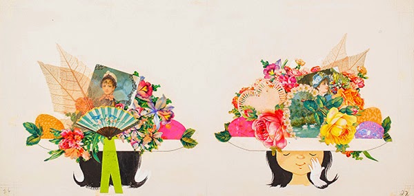
Ezra Jack Keats, “They added a picture of swans . . . leaves . . . and some paper flowers.” Final illustration forJennie’s Hat, 1966. Collage and paint on paper.
Courtesy Skirball Cultural Center
Installation view (replete with interactive bathtub), The Snowy Day and the Art of Ezra Jack Keats.

The Snowy Day and the Art of Ezra Jack Keats is on view at the Skirball Cultural Center (Los Angeles) through September 7, 2014.

Friday, April 18, 2014

100 Strong: Connecting through the power of food


Artist and chef Maggie Lawson draws a clear distinction between ceremony and ritual. A ceremony is a way of formalizing an event in a community; a ritual can be inscribed within that ceremony, or it can be a mundane, everyday occurrence all its own. Ritual, so defined, is fundamental to Lawson’s practice: “Ritual is very important in my work. I like engaging with everyday rituals that have a lot of power.” Like eating. As a chef, this comes easy for Lawson: her recent project, The Takeout Window, was a huge success.  Staged in her North Oakland neighborhood, Lawson transformed her home-studio into a site for engaging passersby in the ritual of sharing food. Envisioned as a one-time event, it was such a success that she staged The Takeout Window a second time.

Food happens to be the catalyst in Lawson’s newest project, 100 Strong, a public performance with a meal at its center. The event will again be staged in Lawson’s neighborhood, a venue that she was inspired to re-use: “[The Takeout Window] made me feel like my whole neighborhood was my studio.” Lawson enjoys drawing on the resources nearest to her, and what better place to stage an art project than in your own backyard?

Maggie Lawson

When Lawson moved to Oakland in 2004 as an Americorps intern, the city had already undergone numerous demographic turns. These days the city’s longstanding African-American population is in transition. Thousands of transplants, many of them young, white locals from San Francisco, are moving to West Oakland for lower rents. Many fear not only that the white influx will displace traditional black residents but that amid all this change the vibrant history and the civic legacy— Oakland is the West Coast’s epicenter of African American civil rights —of the town will be forgotten.

Oakland’s history of demographic shifts goes back centuries. The indigenous Ohlone inhabited the region without interruption for thousands of years before the Spanish arrived in the 1770s, followed by an onslaught of Gold Rush immigrants and settlers in the 1840s. In the 1850s, jobs on the East Bay waterfront drew European, Asian, and African-American settlers; by the 1930s a vibrant African-American community had begun to take hold in Oakland—West Oakland, to be precise. That was one of the few places on the East Bay where African-Americans were permitted to own property; in 1966, black civil rights reached a new height on the West Coast with the formation of the Black Panther Party. Set against these decades, it is somewhat startling to see that in the last ten years, the number of white residents in some parts of Oakland has doubled, nearly equaling the number of African-Americans in certain traditionally black neighborhoods. (Lawson has observed a similar shift in her North Oakland neighborhood, which has not only affected black residents, but other racial minorities; Oakland is one of the country’s most racially diverse cities.) Oakland has a long history of displacement and revival, all viewable from multiples perspectives of identity.

The city’s rich population history seemed to beckon Lawson; it fortified her interest in “the sense of place that already exists and the new aesthetic that’s being laid over it.”  Lawson understood that she was part of this new aesthetic: “I’m coming at this as a white, low-income woman, but still with a fair amount of privilege. What’s my role as an artist and an entrepreneur in gentrification?” These thought processes are what gave birth to 100 Strong, a project that would provide a space to acknowledge the history of her neighborhood, to connect with it, and maybe even to reconcile with it. “With this piece I think we’re coming up against the more dramatic repercussions of gentrification…. No one likes to feel like they’re the gentrifier or the gentrified. This project explicitly intends to grapple with that…to look for some sort of healing around it, bring in this more sacred element to it, of ritual and transformation.”

Since the conversation will develop around a meal prepared by Lawson and her chef collaborators, the menu is important. Whatever they make will reflect the history of the neighborhood. They are still in the process of determining their method (the dinner is six months away), but they’ve been brainstorming: a few ideas include collecting recipes from neighbors, researching dining establishments in the neighborhood from the last two hundred years, and using ingredients from different cultural groups that have inhabited the area. The meal will tell a story of shifting populations, of identities in flux.

Other artists in the area have tackled gentrification, like photographer epli. For her project “Here. Before. Art in a Contested Space,” she lent cameras to five traditional residents in West Oakland (those whose families lived there for multiple generations) to capture their realities. epli’s goal was to stage an honest conversation about the subject, an intention that matches Lawson’s.

Gentrification has a sting to it. It is Lawson’s hope that 100 Strong will encourage people to confront the issue directly; she wants them to ask questions and to reflect on the history of their neighborhoods and their place within it. A paramount concern of Lawson’s is how the value of one’s labor impacts that place. For this reason she has done some financial restructuring since The Takeout Window. Previously, the contributing chefs (her neighbors) were asked to contribute small amounts for the cost of producing the piece; most earned their money back from donations. This time around, Lawson wants funding to be a part of the process, a gesture deeply wedded to the project’s concern with value. (As she asked, “How do we value what we create? What is the value of the social impact we make with our work?”) She wants her collaborators to feel that their contributions are not only appreciated, but valued. A group of community members are helping to raise the funds. So far they number four, among them a food blogger and a graphic designer and illustrator.

A collaboration

100 Strong is a collaborative project. Lawson’s left-hand women are chefs Ikeena Reed and Keri Keifer, both owners of catering businesses in Oakland. Reed has strong ties to North Oakland: her family has been in the neighborhood for four generations. Her mother was a teenager in the Black Panther heyday and participated in their Free Breakfast and Youth Apprentice programs. (Lawson lives just blocks away from the community college where the party’s founding members held their meetings.) Keifer has lived in Oakland for eleven years since leaving her home state of Illinois to join California’s farming and farm-to-table movements. Lawson is also from the Midwest, lured to the culinary mecca that is the Bay Area.

Ikeena Reed

When asked how Reed and Keifer’s backgrounds inform the project, Lawson grew animated: “They’re both spiritual, self-aware people, and we’re negotiating the same dynamic among the three of us that’s taking place out in the neighborhood. I’m really inspired by their work. They create really beautiful things that speak deeply to who they are culturally and to the other folks they’re serving.” All three women are concerned with issues of food justice, and Lawson sees 100 Strong as an opportunity for herself and her collaborators to pursue the creative parts of their craft while also making a social impact.

The other members of Team 100 Strong are fundraisers—the community members mentioned above—and filmmakers. 100 Strong is also a story, and so documentation is fundamental to ensuring access to the project. This includes recording the event itself, but also the process, which is no less important to Lawson. She plans to coordinate with a local filmmaking duo whose company, Radiologie, produces content for small businesses. Lawson says they are masterful storytellers. Aware that there are other ways to document a process besides using video and photography, Lawson is considering other formats: a recipe book, maybe; even the very words you are reading now.

Ultimately Lawson plans to stage an exhibition. This will be her first time strategizing how to use the elements from a community piece to tell a story in a museum or art institution. Her goal is to engage audiences who weren’t present at the performance, but of course she hopes the 100 Strong dining audience will also attend. 

Tuesday, April 15, 2014

Life is a balancing act (Alexis Lago at Couturier Gallery)

Serene and surrealistic, Alexis Lago’s watercolors (and a few oil paintings) call to mind scenes from storybooks or fables, often casting man and nature at odds or in tandem. His exhibition, Possible Moves, is now on view at Couturier Gallery. Expect to be welcomed by a beaming, Klimt-esque oil painting from across the room, this flanked by a whimsical and equally contemplative ensemble of works.


Lago is a Cuban native whose gentle yet crisp strokes lend his work a distinct quality; the same goes for his sensitive treatment of marine animals, a relic of his background in biochemistry. In Penitente (Penitence), a stream of fish fall headlong from the sky like meteors, straight towards a patch of earth in which a man is buried. The man is Lago himself, his head protruding just above the surface, awaiting the inevitable. The painting’s verticality is not isolated; much of Lago’s work assumes this format, highlighting binaries like sky and earth, groundedness and flight. In Concilio de abajo y arriba (Council of Above and Below), a crane extends its neck from out of a sallow sky, looking down (perhaps) on a scene of clashing ships below. It strikes a contrast between the madness of man and the serenity of beasts. Maybe being a polar bear, a solitary creature, isn’t so bad after all.

Lago’s oil paintings are just as vivid. That Klimt-esque painting, Move of the Eraser Fish, is strikingly beautiful. Three men bear the weight of a monstrous fish laden with color, almost like a patchwork quilt. The heavy lifters are in motion, floating through a golden, ethereal space. It is a scene of struggle amidst celebration. The piece calls to mind a painting by the early twentieth-century artist Suzanne Valadon, Le Lancement du Filet (Casting of the Nets)—an imagined prequel to Move of the Eraser Fish.


Indeed Lago leaves much room for imagining. His own creativity encourages it, be it a centaur-portrait or a tree of human portraits in the form of what? acorns? They are whatever you want them to be.

Arbol de la ida y vuelta (Round Trip Tree), 2012
Watercolor on paper

Wednesday, April 9, 2014

The aura of authenticity

The excitement of recognizing an original work of art has a distinct punch. Not only have you struck a personal connection ("That's on my refrigerator magnet!"; "I used that in my thesis!"), but its very reproducibility makes it all the more exciting. You are face-to-face with a celebrity.

Cultural theorist Walter Benjamin argued that the more an original is reproduced, the more its "aura" fades; the less powerful it becomes. (According to Benjamin, aura is a correlate of "authenticity," or originality.) With reproduction now at our fingertips, is the aura all but extinct?

This New Yorker illustration by Rose Blake creates a space for considering Benjamin's theory:

Rose Blake, Sketchbook, The New Yorker, April 14, 2014, p. 59

A museum visitor stands before a towering wall of artwork, the very piece above him displayed on his iPad. It seems absurd, even reprehensible, but it makes perfect sense: By pulling up a reproduction of the original, he's reified the glory of its originality. ("Is this it? ...Yes!") Now consider the position between himself and the artwork: Why remain distant from a work of art when you can hold a version of it in your hands?

Benjamin believed that distance was an affect of power: the more mystifying a work of art, the more powerless the viewer. Reproduction, therefore, is good: it dilutes mystery, it dilutes the "aura."

Aura is not sublimity. A work of art can still carry us away or ground us, even with hand-held technology (as long as the visitor looks up). What is more, today museums are much more conscious of visitor experience. This can have an inverse effect on the quality of exhibitions, but that's a discussion for another time. Concerns have radically shifted since Benjamin's seminal essay of 1936: visitors are a priority as much as artwork (and artists). If a viewer strikes a relationship with a work of art, the museum has succeeded. This isn't to say that museums always prefer proximity over distance. Illustrations like Blake's remind us of this.

I'm not pro-iPad; in fact I cringe at our reliance on hand-held technologies to guide us through experiences. But now that they've been adopted, I can't help but consider how they can also enhance experiences. Some art can be elusive, and a museum can't fill in every gap. Rose Blake's museum visitor, for all we know, might be Googling that painting on the upper right to find out more about it. He will walk away now, perhaps having discovered that even modern art can make sense after all.

Friday, April 4, 2014

Photography as an instrument in prison reform

This post is a continued conversation about SFMoMA's Bearing Witness symposium, March 16.
The irredeemable nature of our prison system can be considered a human rights emergency, and yet the issue is often cast beneath larger shadowsIn an effort to reverse this, freelance writer and curator Pete Brook considers photography’s game-changing role in prison reform. For many, prisoners carry a stigma of sub-humanity that is debilitating and merciless, a condition that, Brook shows us, activists have tackled through the power of photography. The project Tamms Year Ten, prompted by the horrendous treatment of inmates at the super-max prison in Illinois (now closed), invited prisoners—all of whom were in solitary confinement—to request a photograph of their choice to be sent to them. Here is an example of one such request:
A grey & white (mix) “Warmblood” horse(s) in an outdoor environment — shown in action, such as rearing up or jumping or climbing. I’d like the photo to convey freedom, strength, and the wisdom of nature.
Additional instructions: If possible, taken in a cold environment so that clouds of hot breath can be seen.
It’s hard not to liquefy after reading this; the prisoner’s sense of deprivation is so patent as to inspire a visceral awareness of things that we take for granted, like “clouds of hot breath.” The essential humanity of this prisoner is clear; he craves freedom and nature and movement.
Josh Begley, on the other hand, takes a macro approach to prison reform, using photography to capture the geography of incarceration in the United States. His project, Prison Map, culls together aerial photos of prisons, prompting us to consider the abundance of prisons in our country and, most importantly, ask: why so many?
Josh Begley, Prison Map (Facility 226). Google Image. Bearing Witness Symposium, SFMoMA, San Francisco.

Wednesday, March 19, 2014

The List! (Resources for aspiring and/or realized activists)

The following is a compilation of some of the projects and organizations that were represented at SFMoMA's Visual Activism and Bearing Witness symposiums this March. (Many of the titles are also links.)

AIDS AWARENESS

An AIDS coalition that played a formative role in disseminating awareness in the early AIDS crisis and continues to do so. Their longstanding mission is to turn silence, grief and fear into action.

An artist/activist collective that used bold visual tactics to convey the urgency of the AIDS epidemic. Best known for the SILENCE = DEATH campaign and “Kissing doesn’t kill."


An activist organization supporting queer folks and people living with AIDS/HIV in New York City. Among their activities include staging protests and demonstrations, such as their Prevention vs. Prosecution project.


ENVIRONMENTAL JUSTICE

A project that gives voice to the inhabitants of California’s San Joaquin Valley, the proverbial breadbasket of America. The Valley is also riddled with toxins and pesticides that its residents have to live with on a daily basis. Voices from the Valley uses photography, oral history and theater to bring to light this pressing environmental justice issues.


IMMIGRATION

A project launched to rebrand the immigration movement and promote immigrant’s rights. Why not turn immigrants into heroes? Artist and activist Favianna Rodriguez (co-founder of Culture Strike) sees the role of artists today as being one of institution builders.


The Political Equator
Renowned for his work on the Tijuana-San Diego border, Teddy Cruz considers the benefits of artistic experimentation in marginal neighborhoods and how architecture can transform border conflict zones. He rethinks urban development from the bottom up, and believes that the future of cities depends less on building and more on socio-economic relations.
You can see Teddy Cruz’s TED Talk here.

Undocumented and Unafraid
A slogan of the immigrant youth movement. Among the organizations you can seek resources from are the Immigrant Youth JusticeLeague, based in Chicago.


LGBTI RIGHTS

Sexile
A bilingual graphic novel written and illustrated by Jaime Cortez for AIDS Project Los Angeles. It captures the life of the fierce and saucy Cuban transgender immigrant, Adela Vazquez.

You can download the entire publication from the artist’s website.

Jaime Cortez, Sexile (pg. 4), 2004. Ink on paper.

Faces and Phases
A photograph series by photographer and activist Zanele Muholi, Faces and Phases seeks to quell the stereotypes of black lesbians and transgendered people in South Africa, many of whom have been victims of rape and violence. Her work is featured in an exhibition at the Yerba Buena Center for the Arts, Public Intimacy: Art and Other Ordinary Acts in South Africa. Get to know the lovely and charming Muholi here.

Zanele Muholi, Anelisa Mfo Nyanga, Cape Town, 2010


CITIZEN RIGHTS

A collaboration between artists Cheyenne Epps and Kyle Lane-McKinley, this project seeks to document items that have been mistaken for weapons by police who then killed or unlawfully beat the citizens in possession of those items. Objects visualizes this issue through the use of t-shirts, artist’s prints, and a website that depicts drawings of the objects on a world map, along with the events that transpired.


POVERTY

An ongoing documentary project by Natalie Bookchin comprised of video diaries by US residents barely getting by. Giving voice to a silenced group of people, Bookchin asks her subjects questions such as, “What do you think the middle and upper class need to know about poverty?” and “What would you like to tell politicians?” They are told to address an audience not of their class.