Wednesday, October 8, 2014

Candy, etc. at William Turner Gallery

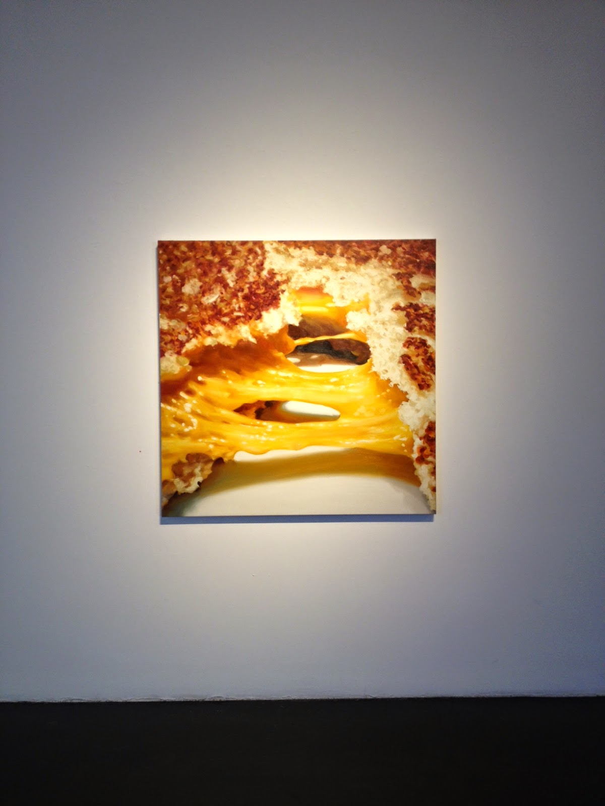
Right, more abstract paintings. That's what Carole Bayer Sager's new work makes you think; but not for long: when viewed up close they look fuzzy— even messy. But at a distance, they assume a level of clarity that verges on the photographic. A classic case of the Monet effect. You need a large space with ample leg room to show this kind of work.

Sager's subject matter is popular: in her solo show at William Turner Gallery, food is the focus. What distinguishes her work are the titles. Many aren't about the food itself but what happens to it after human intervention: Torn, Shredded, Pulled. These stand-alone participles sound mildly aggressive. In many ways, that's what eating is.

On the other side of these actions is delight. Sampled, a delightful mess of boxed chocolates, is a case in point.

Sager makes us think about the food itself. Her Portrait of an M&M Peanut, while somewhat contrived, is an ode to mindful eating. It is the equivalent of a Ken Price sculpture: a view into the anatomy of an object. It's not often that we meditate on the viscera of delectables— and there's no need to, but it's nice to be reminded every now and then.

Carole Bayer Sager: New Works is on view at William Turner Gallery through November 8th.

Torn (detail), 2014, oil on linen, 48" x 48"
Photo: Olivia Fales

Torn, 2014, oil on linen, 48" x 48"
Photo: Olivia Fales

Shredded (detail), 2014, oil on canvas, 84" x 84
Photo: Olivia Fales

Shredded, 2014, oil on canvas, 84" x 84
Photo: Olivia Fales

Portrait of an M&M Peanut, 2014, oil on linen, 36" x 36"
Photo: Olivia Fales

Installation view, with Portrait of an M&M Peanut at center
Photo: Olivia Fales

Wednesday, September 17, 2014

Modern Kimonos at LACMA

Here's a preview of some favorites from the LACMA exhibition, Kimonos for a Modern Age, on view through October 19th.


Woman's Kimono with Abstract Pattern (Japan, c. 1950)
Silk plain weave, stencil-printed warp and weft
Photo: Olivia Fales

Woman's Kimono with Abstract Landscape (Japan, c. 1950)
Silk plain weave, stencil-printed warp and weft
Photo: Olivia Fales

Woman's Unlined Kimono with Abstract Design (Japan, c. 1955)
Silk plain weave, stencil-printed warp and weft
Photo: Olivia Fales

Woman's Kimono with Geometric Pattern (Japan, c. 1955)
Silk plain weave, clamp-resist-dyed warp and weft
Photo: Olivia Fales

Woman's Kimono with Overlapping Hexagons (Japan, c. 1940)
Silk plain weave, stencil-printed weft
Photo: Olivia Fales

Monday, August 11, 2014

Larry Bell, a Venice Beach mainstay

Larry Bell, best known as a pioneer of the Light and Space movement, is also a masterful collagist. Some of his pieces are on display at his namesake restaurant in Venice, Ca., where the patrons, sun-kissed and airy, intersect with the great California Minimalist in more ways than one. His studio is also nearby.

View of Larry's
Courtesy of LA Times/Photo by Dustin Downing

One of Larry Bell's signatures are his plexiglass cubes of the 1960s, translucent and mystical. They were his channel into exploring the properties of light on surface. When light passes through a cube, it undergoes metamorphosis: it is captured, reflected, and transmitted. The artwork becomes a sort of light show.

Cube 16, 2008, coated glass
Courtesy of Frank Lloyd Gallery

At Larry's, the cubes will sneak up on you: They are the inspiration behind the bar's design, which could pass simply (and satisfyingly) as Fiestaware tiles.

The festive bar at Larry's
Courtesy of Savory Hunter

They are also appear as wall art, in the form of his mixed media collages. They are a pleasant surprise that you're only likely to find if you make a trip to the loo. The collages line the wall to your right, all cubes, all part of Bell's fraction series. They glow, radiating an aura that you never imagined inorganic shapes were capable of.

Fraction #1197, 1996, mixed media on watercolor paper
Courtesy of Larry Bell Studio

Fraction #2482, 1997, mixed media on watercolor paper
Courtesy of Larry Bell Studio

Fraction #2296, 1997, mixed media on watercolor paper
Courtesy of Larry Bell Studio


Tuesday, June 17, 2014

John Altoon, little-known giant

John Altoon in his studio, ca. 1968
Image Courtesy of the Getty and Joe Goode

The work of John Altoon is anything but innocuous- and yet, its playfulness can lead you to think otherwise. His paintings and works on paper burst with color; his ink drawings sizzle. Looking at Altoon's work is a bit like walking through a fun house: some images are abstract and distorted; others are crystal clear. It's a successful retrospective that makes you wonder "What's next?" each time you shift left or right. There's candy on every wall.

Ocean Park Series, 1962. Oil on canvas. 72 x 84 in.
Orange County Museum of Art, Newport Beach, CA

Untitled (F-8), 1962-63
Image Courtesy of the Estate of John Altoon and The Box. Photo: Fredrik Nilsen

John Altoon, an exhibition organized by LACMA and the Rose Art Museum (Brandeis University), is the artist's first major retrospective. Altoon died young, at age 43, and his brief career has made him easy to overlook. But he is important. The vinyl quotations on LACMA's gallery walls, with quotes from big names like Ed Ruscha and Billy Al Bengston, are testament to his impact. Many referenced his uncanny ability to fluidly traverse figuration and abstraction; one friend called him the fastest draftsman you will ever meet. Indeed his quick, impassioned lines are electrifying; they enliven every room. I spent one minute following the curls and intersections of a single eye.

Another signature are his phalli, which range from conspicuous to not; some materialize only after a few moments of looking. F-24 (the F refers to "figurative") is a blend of Pop Art and personal touch: a soda can pours out a stream of sludge, the color of body fluid, catching a phallus in its wake. It is playful, grotesque, and strangely erotic-- an effect that, combined with his distinctive use of line, are quintessentially Altoon.

Untitled (F-24), 1962-63
Image Courtesy of the Estate of John Altoon and The Box. Photo: Fredrik Nilsen

John Altoon is on view at LACMA through September 14, 2014.

Tuesday, May 27, 2014

Notes on the history of color perception

There is a limit to our knowledge of other people. How can one articulate their own experience of color, for example? "The chair is blue." ("But what is blue?")

According to philosopher Zed Adams, that question wasn't even considered until the 1600s. The perception of color is a relatively new phenomenon, one whose history Adams presented in a talk (and promotion for his forthcoming book, The Genealogy of Color) at Machine Project in Los Angeles.

Interested in how philosophical questions become philosophical questions, Adams discovered that before the 1600s, it was believed that people experienced color in the same way. Then came a shift: a renewed interest in optics led to the discovery that color is but light reflecting off a surface; that light doesn't just make seeing color possible- it produces color. Since each pair of eyes processes light differently, color, therefore, must be a subjective experience.

Many other corollary discoveries came about from the 1600s on, and, according to Adams, five important ones in particular:

1. Light has a speed.
2. Different color experiences are caused by different sources of light.
3. There are lights that we can't see, like infrared and ultraviolet.
4. Other animals can colors that we can't.
5. Color blindness exists.

It's easy to take for granted these long-accepted facts, but it was revolutionary for thinkers like Isaac Newton and Rene Descartes. Newton believed that seeing color was analogous to hearing sound: pitch was believed to come in seven varieties, so why not color? Descartes didn't necessarily think about variation in color perception so much as the fact that our own ideas about color don't resemble their external causes (the blue chair is not produced by a blue-colored light).

That isn't to say that color wasn't thought about before the 1600s; the ancient Greeks named their colors according to how much light was emitted rather than their hue. (The entry for "colour" in the Cambridge Dictionary of Classical Civilization gives a precise account of this.) The Greek term ochron for example, included a variety of colors - red, yellow, green - because they all have a similar lightness.

Sketch from Rene Descartes, De Homine Figuris, ca. 1633 (Getty Images)

Color circles from Traité de la peinture en mignature, possibly attributed to Claude Boutet, 1708 

Adams' talk, while brimming with food for thought, was at times tiresome: using dates as a device for situating events ("color blindness was first considered in the late 1700s"; "infrared was discovered in the 1800s") is better left for reading material. Then again, he did make the historical focus of his talk clear in its title, "The History of Questioning Color Perception."

And indeed, tying together this history nicely, he concluded with an anecdote: In the 1800s, a man was surprised by the black suit his future son-in-law was wearing as it was the day before his wedding. Turns out it wasn't black; he was just color blind.

Wednesday, May 7, 2014

CP's namesake

So that's what contrapposto is...


Thursday, May 1, 2014

Children's book illustrations, for all ages

Using superlatives are a questionable tool, but it's unavoidable in the case of The Snowy Day and the Art of Ezra Jack Keats, a new exhibit at the Skirball Cultural Center. Based on the luminous and thoughtful work of children's book illustrator Ezra Jack Keats, The Snowy Day is one of the most beautiful, inventive exhibitions I've ever seen. You'll find it rouses your energy on a scale similar to that of their Noah's Ark exhibition. It will invigorate the scroogiest of scrooges.

The Snowy Day proves that book illustrations don't just belong in books. "Finally, he reached the King's high palace" has the glow of a Klimt and the sublimity of a Caspar David Friederich painting. It takes your breath away, in what can only remotely match the awe of a traveler who has reached his destination.

Ezra Jack Keats, “Finally, he reached the King’s high palace.” Final illustration for The King’s Fountain, by Lloyd Alexander, 1971. Paint on marbled paper, mounted on board.
Courtesy Skirball Cultural Center 

But of course, book illustrations are meant for books, and this show is a testament to the value of the hand-held page. One can imagine words scrawled into the space Keats left for them, be it a marbled sky or a mound of snow. But his illustrations, too, can easily stand alone.

Jack Ezra Keats gained notoriety after his publication of The Snowy Day in 1962. It was the first full-color, modern book to feature an African American protagonist-- an important addition to the conversation on civil rights. He went on to publish other books with African American protagonists, a choice that led many to think he was black. Keats, in fact, was the son of Jewish immigrants in Brooklyn.

Ezra Jack Keats, “After breakfast he put on his snowsuit and ran outside.” Final illustration for The Snowy Day, 1962. Collage and paint on board.
Courtesy Skirball Cultural Center
Ezra Jack Keats, “He said goodbye to his mother and father, and off he went.” Final illustration for John Henry: An American Legend, 1965. Collage, paint, and pencil on paper.
Courtesy Skirball Cultural Center
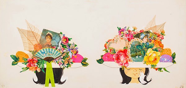
Ezra Jack Keats, “They added a picture of swans . . . leaves . . . and some paper flowers.” Final illustration forJennie’s Hat, 1966. Collage and paint on paper.
Courtesy Skirball Cultural Center
Installation view (replete with interactive bathtub), The Snowy Day and the Art of Ezra Jack Keats.

The Snowy Day and the Art of Ezra Jack Keats is on view at the Skirball Cultural Center (Los Angeles) through September 7, 2014.